Pronto Xi Data Grid UX Transformation
Redesigned the core data grid experience in Pronto Xi — used daily by enterprise users across 1,500+ organisations including Petstock, Haymes Paint, RSEA Safety, Shimano Oceania, and EXEDY Australia to manage high-volume, complex data across finance, operations, and inventory workflows.
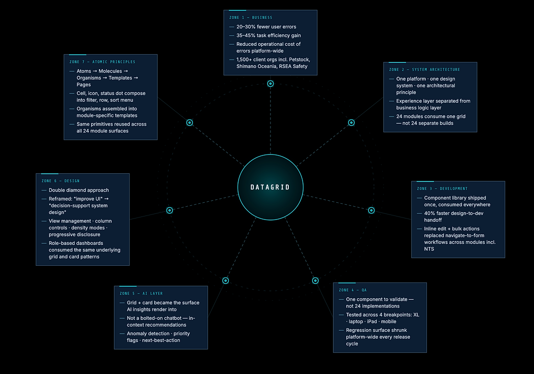
The outcome: a redesign adopted across all 24 Pronto Xi modules — from Financials and Warehouse Management to POS, HR, and Pronto Assist (AI).
PRONTO Xi DATA GRID — THE BACKBONE
One component. Twenty-four modules. Legacy to modern in one transformation.
Overview
The data grid is the beating heart of an ERP system. In Pronto Xi, it's the interface that finance teams, warehouse managers, inventory controllers, and operations staff live in for hours every day — searching, filtering, sorting, and acting on thousands of rows of data.
When I joined the data grid initiative, the system was technically functional but deeply broken for real users. Enterprise clients including Petstock, Haymes Paint, RSEA Safety, Shimano Oceania, and EXEDY Australia — across 1,500+ organisations running Pronto Xi — were working around the interface daily rather than through it.
My job was to fix it. Not just visually. As a system.
Platform: Pronto Xi ERP (enterprise SaaS, B2B) Design system: IBM Carbon principles adapted for enterprise ERP scale Outcome: New data grid interaction system adopted across all 24 Pronto Xi modules
THE PROBLEM — BEFORE I TOUCHED IT
BEFORE — The original Pronto Xi interface

The original Pronto Xi data grid exemplified a poor ERP design: all fields visible, no visual hierarchy, cryptic abbreviations, and a rigid layout that left users powerless.
It lacked clear column grouping, treated all data equally, required navigation for tasks, demanded technical knowledge for filtering, and had a uniform interface across departments.
The core issue wasn't its appearance but its cognitive impact on users, who struggled not due to a lack of training, but because the design forced them to manage the system's complexity mentally.
RESEARCH & DISCOVERY
What I did
-
User interviews with finance, operations, and admin teams
-
Usability testing on the existing grid (5 core task scenarios)
-
Shadowing sessions observing real workflows under real pressure
-
Support ticket and error log analysis
-
Google Analytics behavioural data
-
A/B testing with alternative UI layoutsMulti-device testing across XL monitor, laptop, iPad, and mobile
What users actually said
User feedback from usability tests highlighted several key issues:
A. Users noted the lack of a vertical scroll indicator on the data grid, making it difficult to gauge content below the fold, leading to uncertainty in navigation.
B. While users appreciated the view manager concept, they desired more control, including toggling between icon and ribbon modes, drag-and-drop reordering, and default settings.
C. Users found excessive white space on larger screens unappealing and suggested improved density controls to enhance visual engagement.
D. For tablets, users preferred landscape orientation and sought more responsive touch interactions and the option to hide the navigation panel for better screen usage.
E. A crucial insight revealed that most errors stemmed from misinterpretation rather than system faults, indicating the grid failed to support decision-making and clarity. This reframe guided our redesign.
REFRAMING THE PROBLEM
-
Old framing (wrong): "The data table needs better UI."
-
New framing (right): "Design a decision-support system that gives enterprise users fast, confident control over high-volume data — across every role, every module, every device."
Design principles we committed to
-
Clarity over density — hierarchy should be visible, not memorised
-
Progressive disclosure — show what's needed, reveal what's not
-
Reduce cognitive load — the interface should carry the complexity, not the user
-
Consistency across modules — one interaction model, everywhere
-
Speed of interaction — every extra click is a cost at enterprise scale
Welcome visitors to your site with a short, engaging introduction. Double click to edit and add your own text.
THE DESIGN — WHAT WE BUILT




DESIGN TRANSFORMATION
1. Information hierarchy and visual clarity
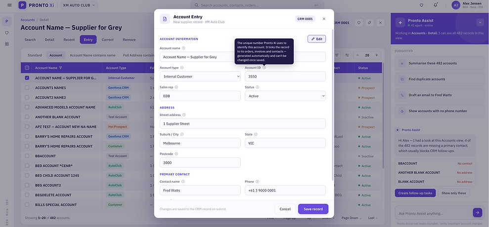
The redesigned grid introduced genuine visual hierarchy for the first time: clear column header weight, row banding for scanability, meaningful use of spacing, and typographic structure that lets users parse 20+ columns without mentally tracking position.
2. View management system
One of the most impactful additions: a full view management system that lets users save, name, duplicate, set as default, and delete personalised column configurations per module. A finance user can save their "Payroll audit" view. A warehouse manager can switch to their "Inbound shipments" view. The system remembers — the user doesn't have to.
3. Advanced filtering and contextual column controls
Right-click on any column header reveals a contextual menu: sort ascending/descending, advanced sort, filter, highlight, aggregate, set alerts, auto-fit, or hide. This collapsed 6–8 separate UI steps into a single contextual interaction.
The advanced filter panel gave users compound, multi-field filtering with plain-English controls — no more needing to know field codes to search.
4. Row density controls
Directly addressing the "too much whitespace at XL" feedback: users can control their own row density using the +/- control in the toolbar. This was a small feature with outsized satisfaction impact — it gave power users back ownership of their workspace.
5. Inline actions and contextual object view
Instead of navigating away to take action on a record, inline actions let users edit, flag, export, or act directly within the grid context. We also introduced an object view — a structured side panel that shows record detail without losing place in the list. This eliminated the biggest workflow interruption in the original system.
6. Scroll visibility and pagination
A specific fix for one of the top usability issues: clear scroll indicators, visible pagination, and page count indicators so users always know where they are in a dataset. Simple. Fundamental. Missing before.
7. Responsive and multi-device layout
The redesign was tested and optimised across XL monitor, laptop, iPad (landscape and portrait), and mobile. Navigation panels were made collapsible. Touch targets were sized appropriately. The view management system adapted to available real estate per breakpoint.
WIREFRAMES & PROCESS ARTEFACTS
The wireframe phase focused on interaction architecture before visual design: mapping every possible user action within the grid, defining the component hierarchy, and establishing the interaction model that would scale across 24 modules.
Key decisions made at wireframe stage:
-
View management as a system-level concept, not a per-screen feature
-
Column header as the primary interaction zone (replacing scattered toolbar controls)
-
Object view as a persistent panel rather than a modal
-
Density control as a user preference saved at account level
AI-ASSISTED INTERACTION LAYER
Beyond the core redesign, I introduced AI-assisted interaction concepts as a forward-looking layer:
-
Suggested filters based on user behaviour patterns across sessions
-
Smart defaults for frequently used column configurations
-
Contextual anomaly highlighting — the system flags unusual values in the grid rather than requiring users to spot them manually
IMPACT & OUTCOMES
Measured results
-
↑ 35–45% improvement in task completion efficiency (usability testing, task timing across 5 scenarios)
-
↓ 20–30% reduction in user errors (support ticket analysis pre/post, A/B testing)
-
↓ Significant reduction in training dependency — new users oriented themselves without assistance in post-launch testing
-
↑ Improved user confidence across all tested roles — finance, operations, admin, and management
Scale of adoption
The redesigned data grid system became the standard across all 24 Pronto Xi modules, including Financials, CRM, eCommerce, and more.
This was a transformation affecting over 1,500 organizations, not just a single-screen redesign. Notable clients impacted include Petstock,mes Paint, Shimano Oceania, and many more across Australia and beyond.
DESIGN SYSTEM CONTRIBUTION
The data grid redesign didn't just improve one screen. It established the foundation for Pronto Xi's component library:
-
Reusable grid component with all interaction states documented
-
Column header interaction pattern (sort, filter, aggregate, hide)
-
View management system — component + governance model
-
Object view panel component
-
Density control component
-
Responsive grid behaviour specs across 4 breakpoints
-
Accessibility compliance documentation (WCAG 2.2 AA)
Every subsequent module that adopted the new grid used these components directly from the design system — reducing design-to-dev handoff time by approximately 40% per module.
WHAT I BROUGHT TO THIS
I focused on systems thinking instead of just surface design, enhancing how enterprise users engage with complex data by creating a consistent system. Research-driven decisions informed every design element, such as density control from user feedback and scroll indicators from usability tests.
I approached the data grid as a product challenge, prioritizing efficiency for 1,500 enterprises over aesthetics. Collaborating closely with engineering from the start minimized friction and provided clear implementation specifications.
CONCLUSION
This is the screen every single user opened every day, across all 24 modules — and nobody had questioned it in years because it was too familiar to notice. I redesigned it as the platform's actual decision surface, not a table. 35–45% faster task completion, 20–30% fewer errors, one component doing the work of twenty-four separate builds.