Built from Scratch. Adopted Across 24 Modules. Still Running.
Pronto Software · Design Systems · Component Architecture · Design Tokens
HYBRID DESIGN SYSTEM
"Anyone can create a style guide. Building a design system that 24 modules actually adopt — and that engineers trust enough to build from — that's a different problem entirely."
THE NUMBERS
24 Pronto Xi modules adopted the design system 40% reduction in design-to-dev handoff time 8 years building, maintaining, and evolving the systemWCAG 2.2 AA compliant across every component
THE CONTEXT — WHY THIS EXISTED
When I joined Pronto Software, Pronto Xi had no design system. It had conventions — informal, undocumented, inconsistently applied — that had accumulated across years of individual module development. Every module looked slightly different. Every designer made slightly different decisions. Every engineering team implemented slightly different components.
At small scale, this is manageable. At enterprise scale — 24 integrated modules, 1,500+ client organisations, retail, wholesale, manufacturing, payroll, HR, supply chain, and everything in between — it becomes a serious business problem.
The symptoms were visible everywhere:
Inconsistent button styles across modules. Different spacing systems in Finance versus CRM. Colour usage that varied by team. Accessibility compliance that existed in some modules and not others. Every new feature required design decisions that had already been made — and forgotten — somewhere else in the platform.
When Pronto Software committed to modernising Pronto Xi from a legacy desktop application to a scalable web platform, I saw the opportunity — and the necessity — to build the design foundation that would make that transformation coherent, scalable, and maintainable.
I built it from scratch. Over 8 years. Across every module. This is what I built.
THE PROBLEM — WHAT ENTERPRISE DESIGN SYSTEMS ACTUALLY SOLVE
Most people think design systems are about visual consistency. They're not — or at least that's not the most important thing they solve.
A design system at enterprise scale solves four business problems:
1. Speed — When components exist, documented, tested, and ready to use, designers stop redesigning the same button for the fifteenth time and engineers stop reimplementing the same dropdown for the twentieth. Design and development velocity increases measurably.
2. Consistency — When every module uses the same component library, users learn the interface once and apply that knowledge everywhere. A finance manager who learns how filtering works in the CRM module doesn't have to relearn it in the Inventory module. Cognitive load drops. Confidence rises.
3. Scalability — When a design decision is made at system level — a colour token, a spacing scale, a typography hierarchy — changing it once changes it everywhere. Without a system, changing a primary colour across 24 modules is a months-long project. With a system, it's a token update.
4. Governance — When design standards are documented and enforced through a shared library, new team members onboard faster, inconsistencies get caught earlier, and the platform stays coherent as it evolves.These were the four problems I was solving. Consistency was just the visible output.
WHAT I BUILT — THE SEVEN LAYERS
Foundations are Pronto Xi. The component layer adopts IBM Carbon across Action, Data display, Navigation & Feedback.
LAYER 1 — DESIGN TOKENS
Token categories:
Primitive tokens — The raw values. Every colour in the palette. Every size in the spacing scale. Every weight in the typography scale. Named for what they are, not what they do. (color-blue-500, spacing-4, font-weight-medium)
Semantic tokens — The design decisions. What a primitive value means in context. Named for their purpose, not their value. (color-interactive-primary, spacing-component-padding, font-body-default)
Component tokens — The specific applications. How semantic tokens apply to specific components. (button-background-primary, input-border-default, table-row-hover)
This three-tier architecture means changing a brand colour requires updating one primitive token. The semantic and component tokens inherit the change automatically — across every module, every component, every screen.
Why this matters:
Every previous Pronto Xi redesign had required manual colour updates across hundreds of individual elements. With the token architecture, global design changes that previously took weeks now take minutes.


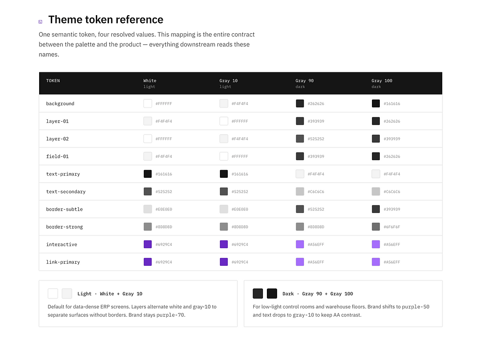
LAYER 2 — ENTERPRISE COLOUR SYSTEM
I built a comprehensive colour framework designed specifically for enterprise ERP applications — not a general-purpose colour palette, but a system engineered for the specific demands of data-heavy, workflow-intensive interfaces.
What makes it enterprise-specific:
Data visualisation colours — A carefully curated set of categorical and sequential colour scales for charts, graphs, dashboards, and financial reporting. Each scale tested for distinguishability under colour blindness conditions.
Status and feedback colours — Consistent semantic colour usage for success, warning, error, and informational states — unified across all 24 modules so users learn the system once.
Density-aware colour decisions — Enterprise interfaces often display hundreds of data points simultaneously. Every colour decision was made in the context of high-density data grids, not isolated UI components.
Light and dark theme support — Every colour in the system has a validated light and dark variant, enabling user-controlled theme switching across all modules without redesigning any component.
WCAG 2.2 AA validation — Every colour combination used for text, icons, and interactive elements was validated against WCAG 2.2 AA contrast requirements. Accessibility wasn't retrofitted — it was designed in from the start.

LAYER 3 — TYPOGRAPHY SYSTEM
A structured typographic scale built for readability across enterprise contexts — from dense financial data grids to narrative reporting dashboards.
LAYER 4 — SPACING & LAYOUT SYSTEM
A consistent spacing scale built on an 8-point grid — every margin, padding, gap, and layout measurement derived from multiples of 8.
LAYER 5 — COMPONENT LIBRARY
The component library is where the token architecture becomes visible — where the design decisions made at system level manifest as reusable, documented, accessible UI elements.
What the library includes:
Form components — Inputs, selects, checkboxes, radio buttons, date pickers, file uploads — all with documented states (default, hover, focus, filled, error, disabled) and WCAG-compliant focus management.
Data display components — Tables, data grids, cards, lists, badges, tags — built specifically for enterprise data density requirements, with configurable density modes and responsive behaviour documented.
Navigation components — Primary navigation, breadcrumbs, tabs, pagination — all built for the multi-module navigation patterns of an enterprise ERP.Feedback components — Alerts, toasts, modals, confirmation dialogs, empty states, loading states — consistent across all modules so users build intuitive expectations.
Action components — Buttons, icon buttons, split buttons, dropdown menus, context menus — with documented usage guidelines for when to use each variant.
Figma architecture:
Every component built using Figma's component system — variants, Auto Layout, interactive components, and variables. Components are self-documenting — the Figma file itself is the specification, not a separate document that gets out of date.
IBM CARBON DESIGN SYSTEM — REFERENCE & ADAPTATION
Pronto Xi partially adopted the IBM Carbon Design System as a reference foundation for UI components — drawing on Carbon's proven enterprise-grade interaction patterns, accessibility standards, and component architecture principles.
However, a full Carbon adoption was deliberately ruled out.
Carbon is built for IBM's product ecosystem — its workflows, its information architecture, and its interaction models reflect IBM's specific product context. Applying it wholesale to Pronto Xi would have broken existing workflows that 1,500+ enterprise organisations depended on daily, conflicted with Pronto Xi's internal design conventions built across decades of enterprise ERP use, and created a migration burden for engineering teams that would have delayed product delivery significantly.
The decision was to adopt Carbon selectively — taking what was proven and applicable, adapting what needed to fit Pronto Xi's specific context, and building original components where Carbon had no equivalent for enterprise ERP workflows.
This is the right way to use a design system reference. Not wholesale adoption. Informed, deliberate, context-aware integration.
The result is a hybrid design system — Carbon-influenced where Carbon's solutions were superior, Pronto Xi-native where the platform's unique requirements demanded it.
Where IBM Carbon was directly applied:
Data Grid / Table Components
Carbon's Data Table component provided the strongest reference point for the Pronto Xi data grid redesign — specifically its approach to column sorting, density modes, row selection, and inline actions. Carbon's patterns were adapted significantly to support Pronto Xi's enterprise data volume requirements, view management system, and the contextual column controls that Carbon's simpler table model doesn't address. The core interaction model was Carbon-influenced. The enterprise-scale architecture was Pronto Xi-native.
Form Components
Carbon's form input patterns — text fields, dropdowns, date pickers, checkboxes, radio buttons, and validation states — provided a proven accessibility-compliant foundation that was adopted and adapted for Pronto Xi's enterprise form density requirements. Carbon's documented focus management, error state handling, and keyboard navigation standards were particularly valuable, ensuring WCAG 2.2 AA compliance was built into the component foundation rather than retrofitted later.
Notification & Alert Patterns
Carbon's notification system — inline notifications, toast messages, banner alerts, and modal confirmations — provided a clear semantic framework for how feedback should be communicated to users. Pronto Xi adopted Carbon's four-tier severity model (informational, success, warning, error) as the standard across all 24 modules, replacing the inconsistent ad-hoc notification patterns that had accumulated across years of individual module development. Consistency in feedback patterns was one of the most impactful improvements for enterprise users navigating across multiple modules daily.
Button Hierarchy
Carbon's button system — primary, secondary, ghost, tertiary, and danger variants — was adopted as the standard button hierarchy across Pronto Xi. This replaced a fragmented button system where different modules had developed their own button conventions independently. Standardising on Carbon's hierarchy gave users a consistent, learnable action model: primary actions are always visually dominant, destructive actions are always flagged with danger styling, and secondary actions never compete visually with primary ones.
The common thread across all four:
Carbon was adopted where its solutions were enterprise-proven, accessibility-validated, and directly applicable to Pronto Xi's interaction model. Where Carbon's patterns needed to scale beyond their original design intent — particularly for data grid complexity and enterprise workflow density — they were adapted rather than applied wholesale.
LAYER 6 — ICONOGRAPHY SYSTEM
A unified icon library of 200+ icons designed specifically for enterprise ERP contexts — not a general-purpose icon set adapted for enterprise use, but icons designed for the specific actions, objects, and states that Pronto Xi users encounter daily.
LAYER 7 — GOVERNANCE MODEL
A design system without governance is a design system that slowly stops being a system.
I built the governance model that keeps the Pronto Xi design system coherent as it evolves — documenting not just what the system contains, but how it grows, how changes are proposed and approved, and how new components get added without fragmenting the foundation.
Governance documentation includes:
Contribution guidelines — How designers and engineers propose additions to the system. What qualifies as a system-level component versus a one-off solution. How proposals are reviewed and approved.
Change management process — How breaking changes are communicated across teams. How deprecated components are retired without breaking existing implementations.
Usage guidelines per component — Not just "here's the button" but "here's when to use the primary button versus the secondary button versus the ghost button, and why.
Design-to-development handoff standards — Consistent annotation standards, redline specifications, and developer documentation that ensure what's designed is what gets built.
THE ADOPTION STORY — HOW 24 MODULES ACTUALLY ADOPTED IT
Building a design system is one challenge. Getting 24 product modules and multiple engineering teams to actually use it is another.
How I drove adoption:
Start with the highest-visibility module. The Data Grid redesign was the first major module built entirely on the new design system. Its success — 35–45% efficiency improvement, adopted platform-wide — became the proof of concept that convinced other module teams to follow.
Make it easier to use the system than to go outside it.
The component library was built to be faster than designing from scratch. Engineers found it faster to implement system components than custom ones. Adoption wasn't mandated — it was incentivised.
Maintain it actively.
A design system that doesn't keep pace with the product gets abandoned. I maintained the system actively — updating components when product requirements evolved, deprecating patterns that no longer served their purpose, and adding new components when recurring design problems emerged.
Document at the point of use.
Usage guidelines live in Figma, next to the components they document — not in a separate Confluence page that nobody reads. Designers get the context they need at the moment they need it.
DESIGN SYSTEM IMPACT
On design velocity
Designers working within the system stopped making foundational decisions on every project — colour, spacing, type, components. Those decisions were already made, documented, and ready to use. Design cycles that previously required days of foundational work now began with real product problems immediately.
On development velocity
Engineers implementing system components worked from clear, consistent specifications — documented states, interaction behaviours, accessibility requirements, and responsive rules all available without asking a designer. The 40% reduction in design-to-dev handoff time was measured across three major module releases.
On product consistency
Users navigating between Pronto Xi modules — from Finance to CRM to Inventory to HR — experience a coherent, predictable interface. The learning curve for new modules dropped significantly because the interaction patterns were already familiar.
On accessibility
WCAG 2.2 AA compliance, embedded at system level, means accessibility isn't a per-project checklist. It's a baseline guarantee that every module built on the system inherits.
On scale
1,500+ enterprise organisations using Pronto Xi are experiencing a product built on this foundation. Every interface they touch — whether in Financials, Warehouse Management, POS, Payroll, or Pronto Assist (AI) — shares the same design language, the same interaction patterns, and the same accessibility standards.
TOOLS & TECHNOLOGY
Design: Figma (component architecture, Auto Layout, variables, variants, interactive components, developer handoff)
Token management: Design tokens structured for multi-platform output — web, mobile, and desktop application targets
Accessibility: WCAG 2.2 AA validation, colour contrast checking, keyboard navigation testing, screen reader compatibility
Documentation: Figma-native documentation, usage guidelines embedded at component levelCollaboration: Cross-functional design reviews, engineering alignment sessions, design QA processes
WHAT THIS PAGE DEMONSTRATES
Design systems are product design, not just visual design.
The token architecture, the governance model, the adoption strategy — these are product decisions that required understanding technical constraints, business priorities, and user needs simultaneously. This isn't decoration work. It's infrastructure work.
I think beyond the component.
Every component in this system was designed in the context of the whole — how it relates to every other component, how it scales across 24 modules, how it performs under the data density requirements of real enterprise users. That systems-level thinking is what makes a component library a design system.
I maintain what I build.Eight years.
The system is still the foundation of Pronto Xi. That's not because I built something perfect — it's because I maintained it actively, evolved it deliberately, and kept it relevant as the product grew. That's what design system ownership actually looks like.
CONCLUSION
A design system is not a deliverable.It's a living foundation that makes everything built on top of itfaster, more consistent, and more scalable.This one has been running for 8 years.Across 24 modules.For 1,500+ organisations.That's what I call a design system that works.