Point of Sale (POS)
THE STRATEGIC DECISION — ONE PLATFORM, THREE EXPERIENCES
"Stakeholders wanted to add more features to fix a usability problem.Research showed the opposite was true.The problem wasn't missing functionality — it was too much functionality, shown to the wrong people, at the wrong time."
Why:
Three genuinely different jobs — retail, wholesale, management — were squeezed into one generic interface, creating friction stakeholders misdiagnosed as a missing-features problem.
How
I ran structured discovery to find the real problem, then made a strategic architecture call — one shared platform with role-based experience layers — instead of building the feature list that was requested.
What I solved:
Replaced one confusing interface with three role-specific experiences on a single scalable design system — cutting cognitive load, reducing support tickets, and creating the architecture pattern Pronto Xi now uses platform-wide.
THE NUMBERS
3
Distinct user groups hidden inside one interface
1
Shared platform architecture preserved across the redesign
14+
Integrated business capabilities unified under a role-based experience model
1,500+
Enterprise organisations impacted across Australia and internationally
DOUBLE DIAMOND
DISCOVER
Mixed-method research — stakeholder interviews, contextual inquiry, on-site shadowing, heuristic evaluation, competitor benchmarking — to find out why users were struggling.
DEFINE
Research surfaced three genuinely distinct user groups. I framed the problem as an architecture decision, not a feature request, and made the strategic call: one shared platform, three role-based experience layers.
DESIGN
Three role-specific experiences built from one shared component library, structured around progressive disclosure — retail stripped to essentials, wholesale account-first, management dashboard-first.
VALIDATE
15* rounds of user testing across wireframes and prototypes — moderated usability sessions with retail, wholesale, and management users
OVERVIEW
Pronto Xi's Point of Sale solution is one of the most functionally rich POS platforms in the Australian enterprise market — fully integrated with inventory, finance, CRM, pricing, promotions, warehouse operations, BNPL, eCommerce, offline selling, and Business Intelligence reporting across retail, wholesale, and trade businesses.
The problem wasn't capability. The platform had too much of it — and was delivering all of it to everyone, all the time.
A retail cashier processing a transaction under queue pressure was navigating the same interface as a wholesale operator managing account credit and a store manager reviewing KPI dashboards. Same menus. Same workflows. Same cognitive load. Completely different jobs.
My role was to redesign not just the screens, but the entire experience architecture — introducing a role-based model that gave each user exactly what they needed, without rebuilding the platform from scratch.
My role: Lead UX Designer — owned end-to-end from research strategy through to design system delivery and engineering handoff Platform: Pronto Xi ERP (enterprise SaaS, B2B, retail & wholesale) Clients impacted: Petstock, Haymes Paint, RSEA Safety, Shimano Oceania, Wallace Bishop, and 1,500+ organisations
When I started the discovery phase, the stakeholder brief was clear:
1. users are frustrated
2. support tickets are high
3. training times are too long.
The proposed solution from the business was equally clear: add more features to address the complaints.
I pushed back. Before committing to any solution, I needed to understand what was actually causing the friction.

THE PROBLEM — WHAT WAS ACTUALLY BROKEN
What the research revealed changed everything.
The existing POS architecture treated every user as though they performed the same job. Retail cashiers, wholesale operators, and store managers all navigated identical menus, dashboards, and workflows — despite having fundamentally different responsibilities, success metrics, and information needs.
The result was predictable:
-
Visual clutter that slowed everyone down
-
Excessive navigation steps for simple, high-frequency tasks
-
Critical information buried under irrelevant features
-
High cognitive load during fast, pressure-driven transactions
-
Staff working around the system instead of through it
-
Long onboarding times because the interface required memorisation, not intuition
-
Rising support tickets — not because the system was broken, but because it was confusing
The insight that reframed the entire project:
Users weren't frustrated because features were missing. They were frustrated because the right features weren't surfaced to the right people at the right moment.
Adding more functionality would have made the problem measurably worse.
RESEARCH — HOW I GOT TO THE REAL PROBLEM
I ran a comprehensive mixed-method research programme across multiple enterprise retail and wholesale clients. This wasn't a single round of interviews — it was a structured discovery programme designed to answer specific strategic questions.
Strategic questions I needed to answer:
-
How do retail staff actually perform daily transactions under real pressure?
-
How do wholesale operators fundamentally differ from retail users?
-
What do managers actually need to make fast operational decisions?
-
Which workflows generate the most friction — and why?
-
Which features are essential versus rarely used by each group?
-
How do we reduce complexity without reducing capability?
What the research found:
Three completely distinct user groups emerged — each with different goals, different workflows, and different definitions of success.
Customer research: stakeholder interviews, user interviews, contextual inquiry, on-site observations, user shadowing, customer journey mapping, pain point mapping, persona validation
Product evaluation: heuristic evaluations, product audits, competitor benchmarking, workflow analysis, information architecture reviews, current state vs future state mapping
Design collaboration: stakeholder workshops, design studios, design critiques, affinity mapping, prioritisation workshops
Validation: wireframe testing, prototype testing, moderated usability testing, A/B testing, stakeholder reviews
Heuristic analysis — a specific check, not just a research method in a list:
I ran a heuristic evaluation of the existing POS interface against Nielsen's usability heuristics, scored by severity and frequency, before any redesign work began. Three violations stood out as both the most severe and the most frequent:
-
Recognition rather than recall — the interface required memorisation, not intuition, which is exactly why onboarding took so long and staff kept working around the system instead of through it.
-
Flexibility and efficiency of use — no shortcuts or accelerators for high-frequency tasks, so a retail cashier processing the same transaction fifty times a day took the same number of steps as someone doing it for the first time.
-
Match between system and the real world — one interface, one mental model, applied to three completely different jobs. A wholesale account manager and a retail cashier don't think about their work the same way, but the system assumed they did.
These three findings were the evidence base for the role-based redesign — not a general "the UI feels dated" observation, but specific, named violations that pointed directly at the same-interface-for-different-jobs problem.
PERSONA: THE THREE USERS
Retail Staff - Designed for Speed

Store Managers — Designed for Decision Making

Wholesale Operators - Designed for Account Management

THE STRATEGIC DECISION — ONE PLATFORM, THREE EXPERIENCES
This was the most consequential design decision of the entire project, and the one I'm most proud of.
When it came to architecture, there were two paths:
Option A — Three independent POS applications Build a separate application for retail, wholesale, and management. Clean separation. Full control per persona.
The problem: Three codebases. Three design systems. Three maintenance streams. Exponential implementation cost. Impossible to scale across 1,500+ client organisations with different configurations.
Option B — One shared enterprise framework with role-based experience layers Maintain a single platform and codebase. Dynamically adapt the experience — navigation, dashboards, permissions, information hierarchy, workflow sequences, and feature visibility — based on user role.
The advantage: One platform. One design system. One codebase. Infinite contextual experiences.

I recommended Option B. The business approved it.
This decision was not just a UX call — it was a product strategy call. It required me to understand technical feasibility, implementation cost, scalability across a client base of 1,500+ organisations, and long-term maintenance implications. I worked across product, engineering, and business stakeholders to validate and align on this approach before a single screen was designed.
The principle: separate the experience layer from the application architecture.
USER FLOW PER ROLE

THE DESIGN — WHAT WE BUILT
Retail Experience
Stripped back to the essentials. Fast checkout flow. Large touch targets. Minimal distractions. Barcode scanning as the primary interaction. Payment flows designed for speed with clear error states — insufficient funds, card declined, change due — all handled with minimal steps.


Wholesale Experience
Account-first navigation. Customer lookup leads to order history, pricing agreements, and credit status before any transaction begins. Designed for longer sessions, deeper data interaction, and relationship management rather than speed.


Manager Experience
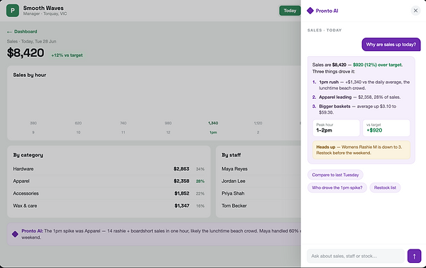
Dashboard-first. KPI visibility above the fold. Drill-down from summary to detail. Designed to answer operational questions without navigating through transaction workflows.


PROGRESSIVE DISCLOSURE
THE DESIGN PRINCIPLE THAT CONNECTED EVERYTHING
Shared design system
All three experiences were built from the same component library — consistent interaction patterns, shared tokens, unified accessibility standards. The role determined what was shown, not how it was built.
The unifying interaction principle across all three experiences was progressive disclosure — surface what's needed for the task at hand, and reveal depth only when it's required.
For retail: the checkout screen shows nothing but the transaction. Promotions, returns, and overrides are one tap away — present but not cluttering the primary flow.
For wholesale: account summary leads to order detail leads to pricing history. Each layer reveals the next without overwhelming the starting view.
For managers: KPI headline leads to store breakdown leads to individual transaction detail. The same data, structured for analytical rather than operational use.
This principle reduced cognitive load across all three user types without reducing any capability.
From Memory to Intelligence — AI-Powered Wholesale Tier System
As part of the redesign, I identified a set of AI-powered enhancement opportunities built into the design system as a roadmap layer:
-
Intelligent workflow recommendations based on user behaviour patterns
-
Context-aware task assistance during complex transactions
-
Smart product search with predictive results
-
Automated operational insights surfaced in the manager dashboard
-
AI-generated reporting summaries reducing manual analysis time
-
Personalised dashboards adapting to individual usage patterns
How I Brought This to Life
The Idea
During wholesale user research, I watched operators switch between multiple screens — payment history, order frequency, credit status — before making a single decision on a customer account. The data existed. It just wasn't where they needed it. That gap became the idea.
The Design
I designed a Trader Intelligence Panel embedded directly into the wholesale order flow. It appears automatically when an operator opens a customer account — no extra navigation, no separate reports. Four tiers — Bronze, Silver, Gold, Platinum — each reflecting real trading behaviour: payment reliability, order consistency, account tenure, and order value. Each tier surfaces a clear recommended action so operators always know what to do next.
Convincing the Business
I didn't pitch it as a UX feature. I pitched it as a revenue protection tool. I showed three real scenarios from our research — a Platinum trader receiving the same friction as a new account, a late-paying Silver account receiving Gold-level credit, an operator missing a reorder window because the system gave them no signal. Then I asked: "How many of these decisions are your operators making from memory every day?" That reframe got the room aligned immediately.
The Result
Operator-only. Invisible to customers. Built as a foundation for future AI capabilities — predictive reorder alerts, credit risk scoring, and churn detection — feeding directly into the Pronto Assist AI roadmap.

PROCESS ARTEFACTS
The wireframe phase mapped every user flow per role before any visual design began — establishing the interaction architecture that would drive the role-based switching model.
Key artefacts produced:
-
Role-based user flow maps (retail, wholesale, manager)
-
Information architecture per role
-
Progressive disclosure interaction model
-
Component library with role-adaptive states
-
Iconography system designed for fast recognition in high-pressure environments
-
Accessibility documentation (WCAG 2.2 AA)
-
Engineering handoff specifications
IMPACT & OUTCOMES
Experience outcomes
-
Measurably reduced cognitive load across all three user groups in usability testing
-
Faster task completion for retail staff — fewer steps to complete a standard transaction
-
Improved workflow efficiency for wholesale operators — account information surfaced without navigation
-
Stronger KPI visibility for managers — operational decisions made from the dashboard without drilling into transactions
Business outcomes
-
Reduced support ticket volume — users could find what they needed without assistance
-
Faster staff onboarding — role-appropriate interfaces required less memorisation
-
Increased product adoption — features became discoverable for the users they were built for
-
Greater platform scalability — one codebase serves infinite role configurations across 1,500+ client organisations
-
Increased enterprise licensing opportunities — the role-based model became a differentiating sales feature
Strategic outcome
The role-based experience architecture became the foundation for future Pronto Xi product development — establishing a scalable model for how the platform adapts to user context across all modules, not just POS.
WHAT THIS CASE STUDY DEMONSTRATES ABOUT HOW I WORK
-
I pushed back on the brief. When stakeholders wanted to add features, I ran research first. The research proved they were wrong. I had the evidence and the confidence to redirect a major product initiative.
-
I made a product strategy call, not just a design call. The Option A vs Option B decision required understanding technical architecture, implementation cost, and scalability across a 1,500+ client base. I brought that thinking to the table — not just wireframes.
-
I designed a system, not screens. The role-based experience model, the shared design system, the progressive disclosure architecture — these are systems-level decisions that will scale long after any individual screen is redesigned.
-
I understood the real users. The three personas weren't invented in a workshop. They emerged from contextual research, on-site shadowing, and real workflow observation. Every design decision traces back to a specific finding.
CONCLUSION
Stakeholders asked for more features. I gave them three experiences instead — retail stripped to essentials, wholesale built around the account, management built around the decision. Same platform, same codebase, and 1,500+ organisations running an interface that finally matched the job each person actually had.
One platform. Three experiences. Designed for the people who actually use it.