PRONTO XI - DASHBOARD
From a Static Landing Page to a Role-Based, Scalable Workspace
"Every user opened the same dashboard, regardless of what their job actually was. A payroll officer and a sales rep saw identical screens. I redesigned it as a platform, not a page — one framework, twenty-four modules, a different workspace for every role."
The Problem:
Every login opened the same static homepage — whether you managed payroll or a sales pipeline, the platform had grown to 24 modules without ever asking who was actually looking at the screen each morning.
The Approach
Rather than polish the existing layout, I traced the problem back to its architecture, then built one configurable framework instead of drawing twenty-four separate screens by hand.
The Result
A static homepage became a role-aware workspace — the same underlying components, reconfigured per login, so the right number reaches the right person first.
THE NUMBERS
45% Fewer Unnecessary Widgets Displayed
30% Faster Access to Daily Tasks
4 → 1 Navigation Steps for Key Activities
24 Modules Run on One Dashboard Framework
DISCOVER: Audited the live dashboard directly — eighteen portlets, years of accumulated widgets, nothing distinguishing one role's priorities from another's — to see exactly what was competing for attention and why none of it stood out.
DEFINE: Mapped every module against the person actually logging into it each day, then redrew the brief: not a cosmetic refresh, but one reusable framework capable of serving payroll, sales, and service teams differently from a single codebase.
DESIGN: Assembled role-based workspaces from one shared component library — the same KPI cards, activity feeds, and charts, reconfigured per login instead of rebuilt as separate designs for each module.
VALIDATE: Roughly 3–4 rounds of testing per module, across 5–6 modules — including Finance, Payroll, HR, and CRM. The CRM view — Sales Rep, Sales Manager, Service Manager — is one example; the same validation ran across the other modules too.
Legacy v750 dashboard
When I started looking at the legacy Pronto Xi dashboard, I found a single, static landing page — every user, every role, every module, staring at the same generic layout regardless of what they actually needed to get done that day.
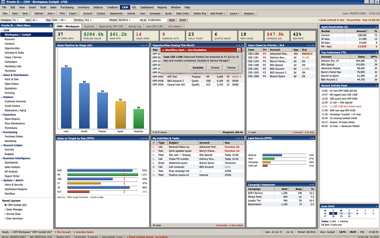
The Problem With the Old Dashboard
No visual hierarchy — everything shouts at the same volume.
Everything shouts at the same volume.The KPI strip runs ten metrics in a single row, all identical size, all identical dark navy. "$61.2k WON MTD" and "9 OVERDUE ACTS" carry the same visual weight — a win and a warning look exactly alike. The user has to read every number to find out which ones need action today. Nothing on the screen tells them where to look first.
I didn't need to run a research session to find the first problem
It was sitting right there on the screen.
A single view carried eighteen portlets simultaneously — pipeline charts, aged receivables, campaign responses, SLA alerts, a calendar — all rendered at identical visual weight, with nothing telling the user what needed attention right now versus what was just there for reference.
I watched a critical SLA breach alert appear as a modal, then again in a portlet behind it, then a third time in the activity feed — one real event, three uncoordinated warnings, and nothing in the system deciding which one actually mattered. The interface had access to every kind of enterprise data. It had no concept of who was looking at it.
That's when I realised this wasn't a visual design problem. It was an architectural one: Pronto Xi had never designed a dashboard system — only a dashboard page, copied forward as the platform grew to 24 modules.
THE REFRAME
The brief I was handed could easily have stopped at "make the dashboard look modern." I chose to design around a different question instead:
what does this specific person need to see the moment they log in, and how do I build that without redesigning it 24 separate times?
That second half of the question is what turned this into a platform problem for me, not just a screen problem.
WHAT I BUILT
Role-based dashboards, not one-size-fits-all.


A single component framework behind every version of it.
I built every role-based dashboard from the same underlying components — KPI cards, widgets, charts, activity lists — configured differently per role, permission, and module rather than rebuilt from scratch each time. The same KPI card component that shows pipeline value for Sales shows payroll exceptions for HR. One framework, reused, never duplicated.
EXAMPLE - THE CRM JOURNEY — THREE ROLES, ONE FRAMEWORK


Responsive by design, not by exception.
I designed desktop to carry multi-column analytical layouts, then had tablet and mobile automatically reflow into prioritised card layouts — the same underlying data, restructured for the constraints of the device, with nothing critical lost along the way.
Personalisation without fragmentation
I built five visual themes, including Dark Mode, so organisations and individual users could adjust their workspace — layered on top of the same component system, so personalisation never breaks consistency underneath it.
I put the switcher directly in the global header, a single click away, rather than burying it in a settings menu, because I wanted theme choice to feel like a normal part of how someone works, not an advanced preference.
Every theme runs through the same token set as the rest of the design system, so switching from the default dark navy to a lighter or brand-coloured variant never touches layout, hierarchy, or component behaviour — only colour.
An organisation can standardise on one theme for consistency, or leave it to individual preference, and either way there's no second dashboard for anyone to maintain.
PLATFORM THINKING
This is the same architectural principle I carried through every major Pronto Xi initiative I led: build the system once, let every module inherit it.
I didn't design 24 different dashboards. I designed one configurable dashboard framework — reused across Finance, Payroll, HR, CRM, Inventory, and Manufacturing, with role, permission, and module configuration determining what actually renders. Developers configure a new dashboard rather than build one from nothing. QA validates one component once, rather than 24 separate implementations. Every future module inherits the framework by default, instead of needing its own dashboard designed from scratch.
That's what "Single Module Experience" meant in practice for me: the user stays focused within their own business domain, but the platform underneath them stays singular — one architecture, quietly supporting every role that touches it.
The same architecture is also what let me turn the dashboard into a usable surface for Pronto AI. The Quota to Goal card doesn't just display data — it feeds a generated recommendation at the bottom of the screen: which deal to prioritise, and why, based on what's actually sitting in that Sales Rep's pipeline right now. That only works because the dashboard already knows who's looking at it and what they're responsible for — the same role-based foundation I built for human clarity turned out to be exactly what the AI layer needed too.
IMPACT
Here's what changed once the framework was live:
45% fewer unnecessary widgets displayed per user — because the dashboard now shows what's relevant to the role logged in, not everything the platform is capable of showing.
30% faster access to daily operational tasks, with key workflows reduced from four navigation steps down to one.
One framework supporting 24 modules — new modules configure into the existing dashboard system rather than requiring a bespoke build, reducing both design and development effort for every future rollout.
Consistent behaviour regardless of role, module, or device — standardised components simplified regression testing platform-wide, turning 24 potential dashboard implementations into one validated system.
CONCLUSION
Every login used to open the same page, no matter who you were. Now it opens the page built for your job — five widgets instead of eighteen, the number that matters most shown first, and an AI recommendation sitting right there instead of buried in a report. 45% fewer unnecessary widgets, 30% faster to the tasks that matter, across all 24 modules from one framework.